NativeMobile
Three mobile apps, and what earns a place on the phone.

Uplisting
The calendar property managers check between turnovers.
- Design Lead · Freelance Designer
- Uplisting, D. Suricate, BDV
- iOS · Android
- 2021 – 2026
This page brings together my native mobile work: Uplisting, an iOS and Android app built in 2025 for which I led design, and two apps I designed as a freelancer in France, D. Suricate and BDV. Both freelance apps shipped in 2021. I redesigned them in 2026 to show how I’d approach them today.
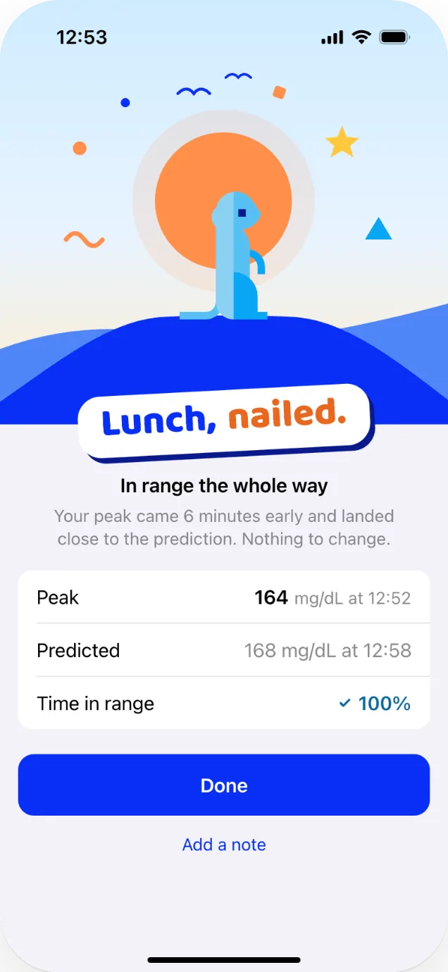
A lot of the work on each one was deciding what belongs on the phone. On Uplisting, we surfaced the in-the-moment tasks, like replying to guests, kicking off tasks and checking in with cleaners, and kept the larger decisions and heavier calculations on desktop. BDV moves a paper form onto the agent’s phone so a buyer can sign it during the viewing. In D. Suricate, a person starts a meal, then the app shows when their glucose is expected to peak and suggests a correction if it runs high.
How I approach mobile
Design for the moment
One hand, half their attention, somewhere other than a desk. The design starts from where the phone is, not from the feature list.
Every tab earns its place
The phone doesn't get everything the desktop has. What comes along is chosen from what people actually do on the go.
Platform first, brand on top
Patterns people already know from iOS and Android come first. The brand carries through a shared system, not custom controls.
Uplisting: the calendar in your pocket
Property managers run Uplisting from a desk, but a lot of the job happens away from it: at a changeover, between properties, when a guest message comes in late at night. The app had to cover those moments without trying to be the desktop product.
I led design on the app, working closely with the PM and engineering lead, with a contractor on the design system. It shipped on iOS and Android from one React Native codebase.
What made the cut
We studied how many tabs the bar should hold, and used what we heard from users plus usage data to sort the jobs people do on the phone from the ones they save for a desk. Four made the cut.

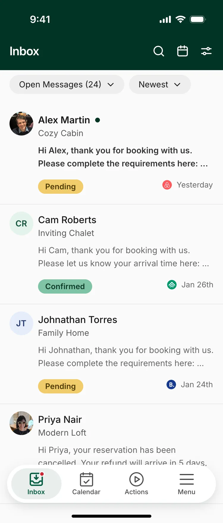
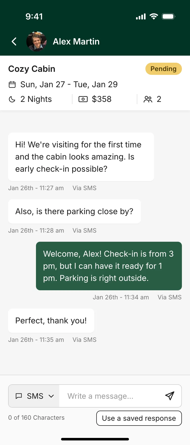
- Messages arrive on the go and need an answer right away, so Inbox comes first.
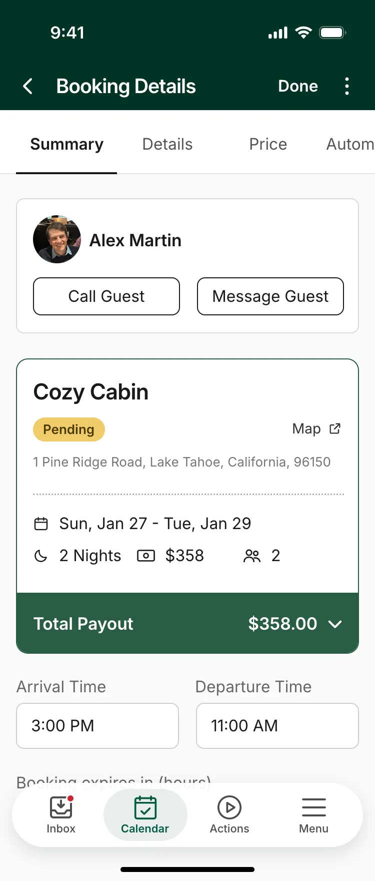
- A quick check that everything is fine. Not the place for big pricing changes.
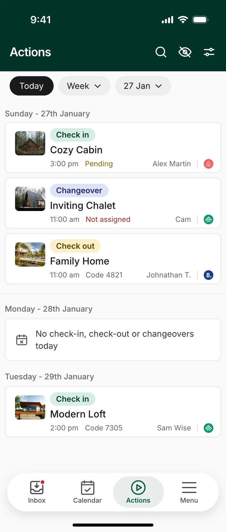
- What's happening right now across every property: check-ins, check-outs, changeovers.
- A few extras, like search and listings. Deliberately not everything from desktop.
The calendar
The calendar is where property managers spend most of their time in the app, and it's where most of the change happened. The version we inherited was a booking grid: truncated property codes, four days at a time, and colored bars. It told you who was staying, but not what needed doing.
The redesign kept the grid and changed what each row carries.
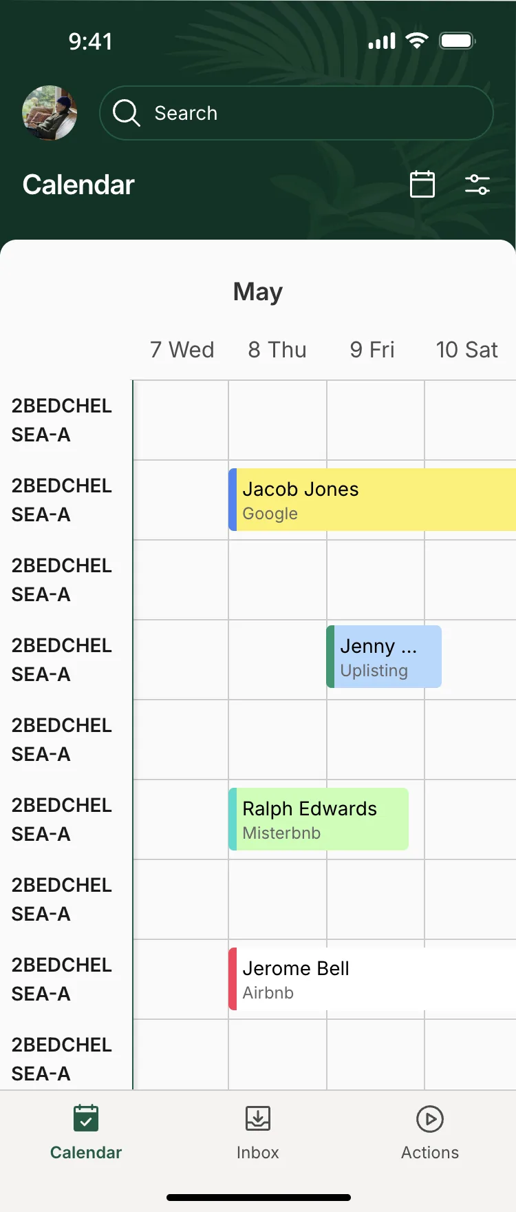
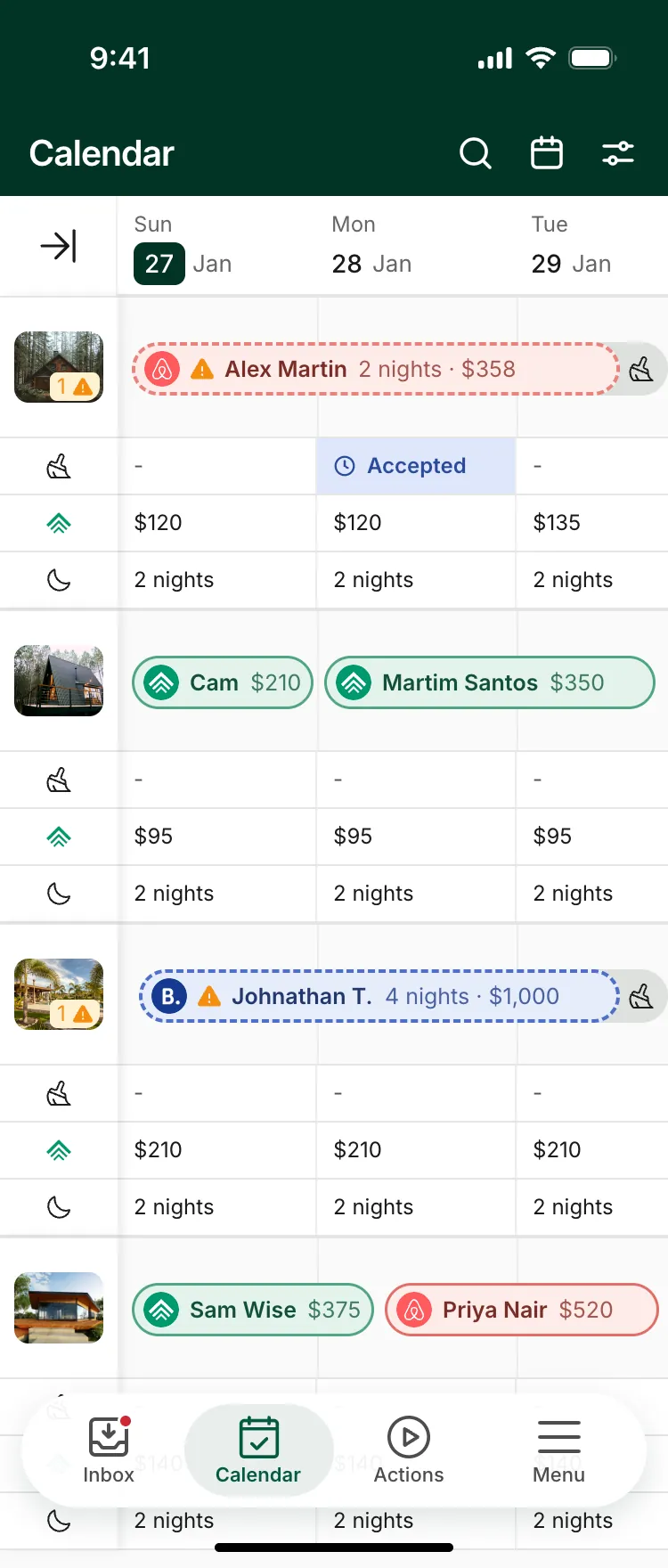
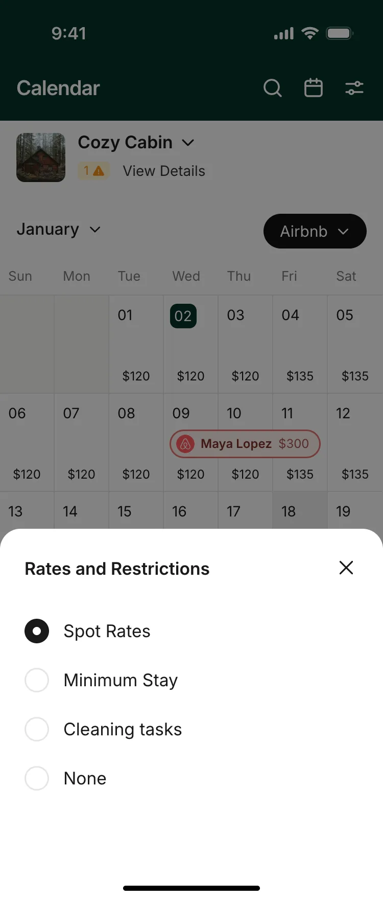
- 1A property column that stays putPhotos instead of truncated codes. It stays pinned while the dates scroll, and collapses to give the week more room.
- 2Accessible channel and statusBookings differ by more than color and text. The channel is an icon, status is a solid or dashed outline, and pills that need telling apart get their own texture, so nothing rests on color alone.
- 3The week's details, right in the gridEach listing shows its daily rate, cleaning tasks, minimum stay, bookings and rates on other channels. You choose which to show or hide, so checking the week doesn't mean opening every property.
- 4One listing, a month at a timeTapping a property opens its month, with a sheet to choose what the grid shows.
Beyond the calendar
The rest of the app follows the same idea. Each screen answers one question someone has away from their desk, and gets them back to what they were doing.
What we heard
People raved about the calendar. It was so much easier to understand and navigate, they could get a pulse on what to prepare for or what needed their attention, and it was much more appealing to look at.
The app felt cleaner and smoother, and people said they didn’t get lost in it anymore.
The new functionality was all really useful, especially the monthly calendar view and the updates to the Actions tab.
D. Suricate: on watch after the meal
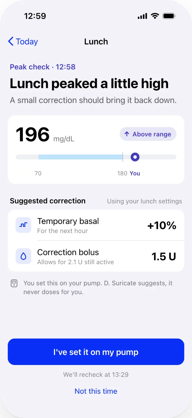
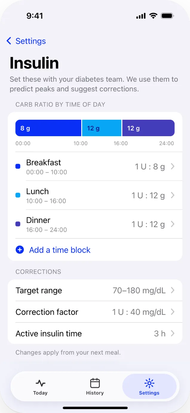
D. Suricate helps people with Type 1 diabetes who use an insulin pump get through the hours after a meal. It predicts when their glucose will peak, checks it at that moment, and if it runs high, suggests a correction they confirm on their pump.
D. Suricate shipped on iOS in 2021. I designed it as a freelancer, working directly with the client. I came back to it this year to bring in the latest iOS design principles and improve some of the UX, while keeping the functionality we defined together.
Five steps, one screen
In 2021, a meal was five separate steps: enter your level before eating, confirm you're done, enter it again, see the predicted peak, then check back at the peak. The redesign assumes a glucose sensor (the 2021 copy already mentioned one), so the app can do the watching. That collapses the five steps into one screen that answers one question: when is my peak?
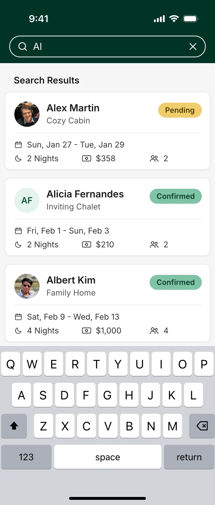
The home screen does two things: it shows where you are right now, and it lets you start a meal.
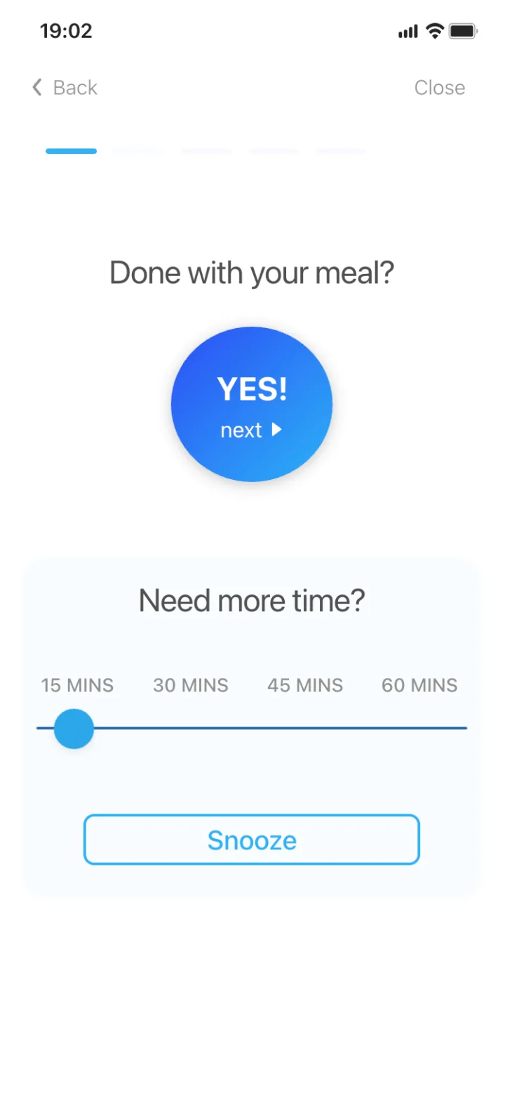
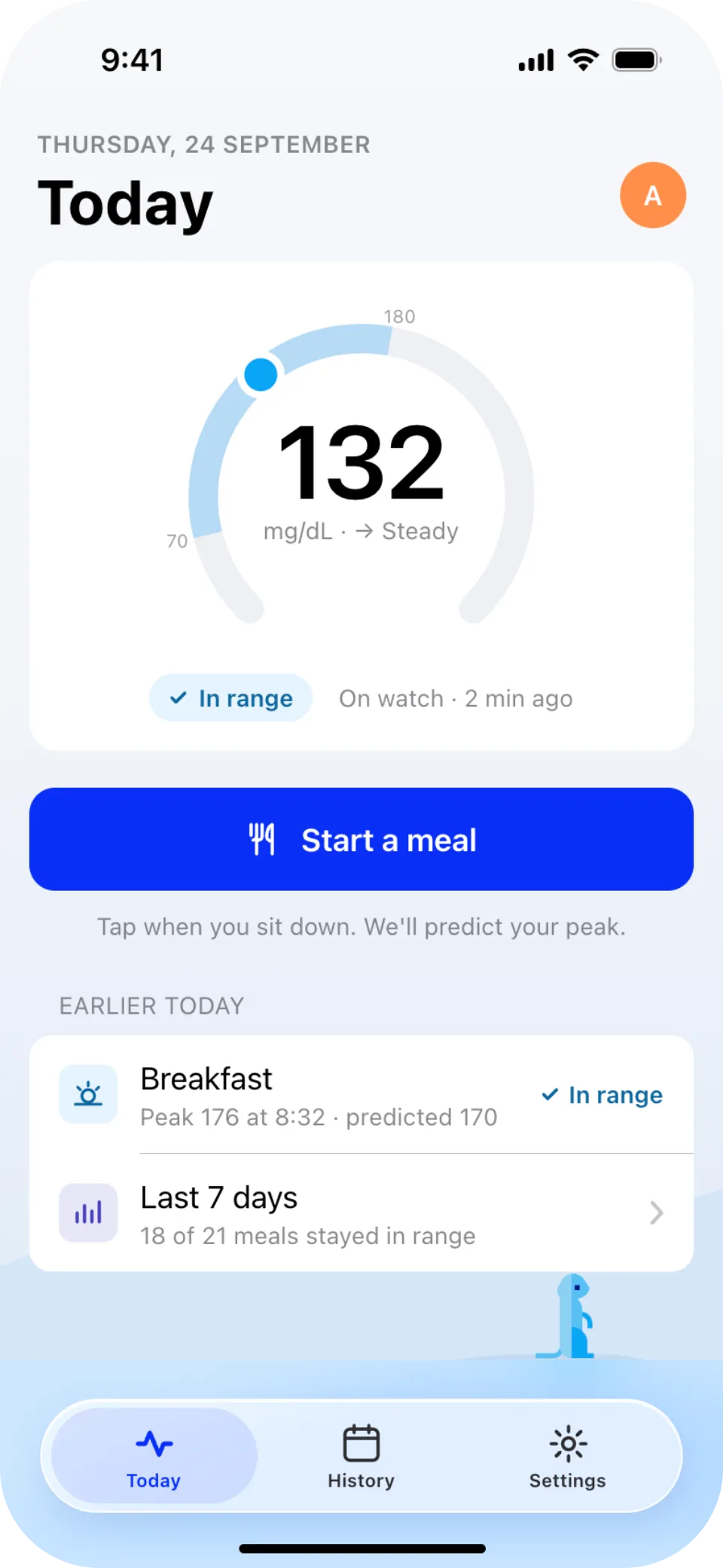
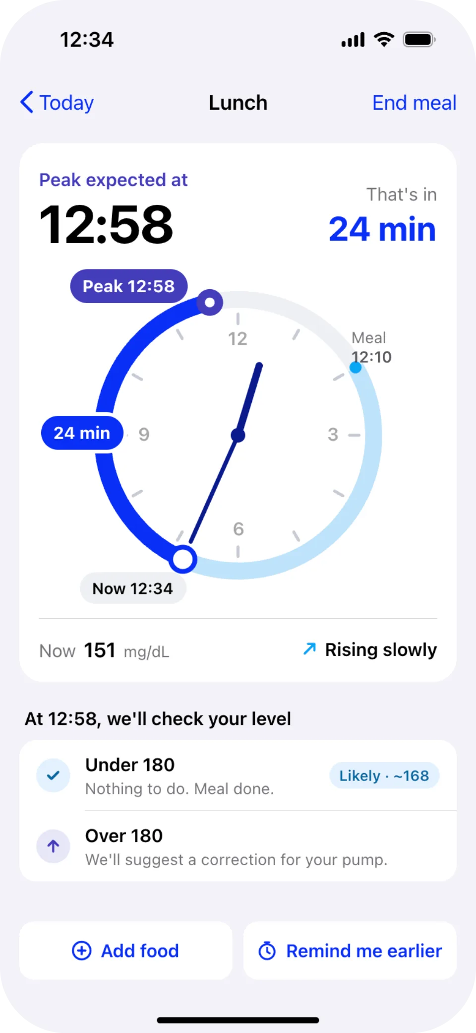
- 1Where you are, at a glanceA ring shows the reading against the 70–180 range, so there's no chart to read.
- 2One thing to do"Start a meal" is the only filled button, because it's the one thing the app needs from you.
- 3The peak, on a clockThe minute hand is now and the filled arc runs to the predicted peak, so the countdown is tied to real time.
- 4Both outcomes, up frontUnder 180 and the meal is done. Over 180 and the app suggests a correction for the pump.
After the peak
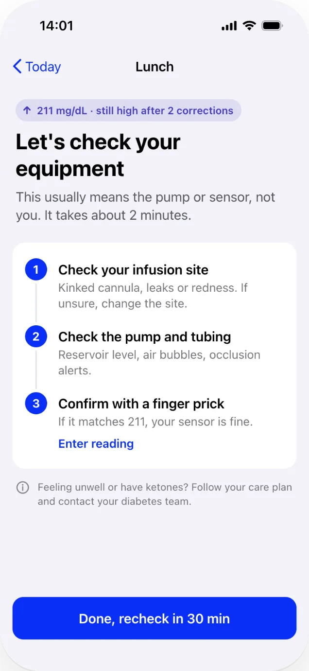
When the reading is high, the next few screens matter most: a suggested correction, then a check of the equipment if it stays high. We kept them short and calm, because that's when someone is least likely to want to read. Orange, the brand's second color, never appears on glucose data, because glucose apps read it as "high".

BDV: proof of the visit
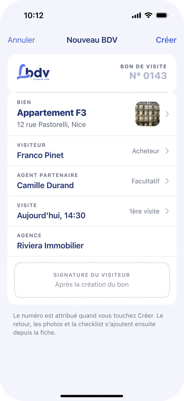
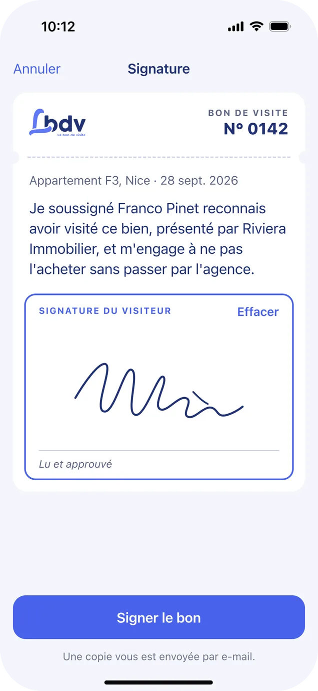
In France, a buyer signs a bon de visite when they view a property. It's the agent's proof that they made the introduction, so they can't be cut out of the sale. BDV is an app where the agent fills in that slip and the buyer signs it, all on the agent's phone.
BDV shipped on iOS in 2021, and I designed it as a freelancer, working directly with the client. This year I went back to it with the latest iOS design principles in mind and reworked some of the UX around the slip, while keeping the functionality we had defined together.
One slip, everywhere
An agent with several bons open needs to know two things at a glance: where each one stands, and what happens next. So every BDV is a slip that carries its number, its stage and its next step, with its details as fields down to the signature box.
The home screen is organized by the things an agent deals with: bons, properties and buyers.
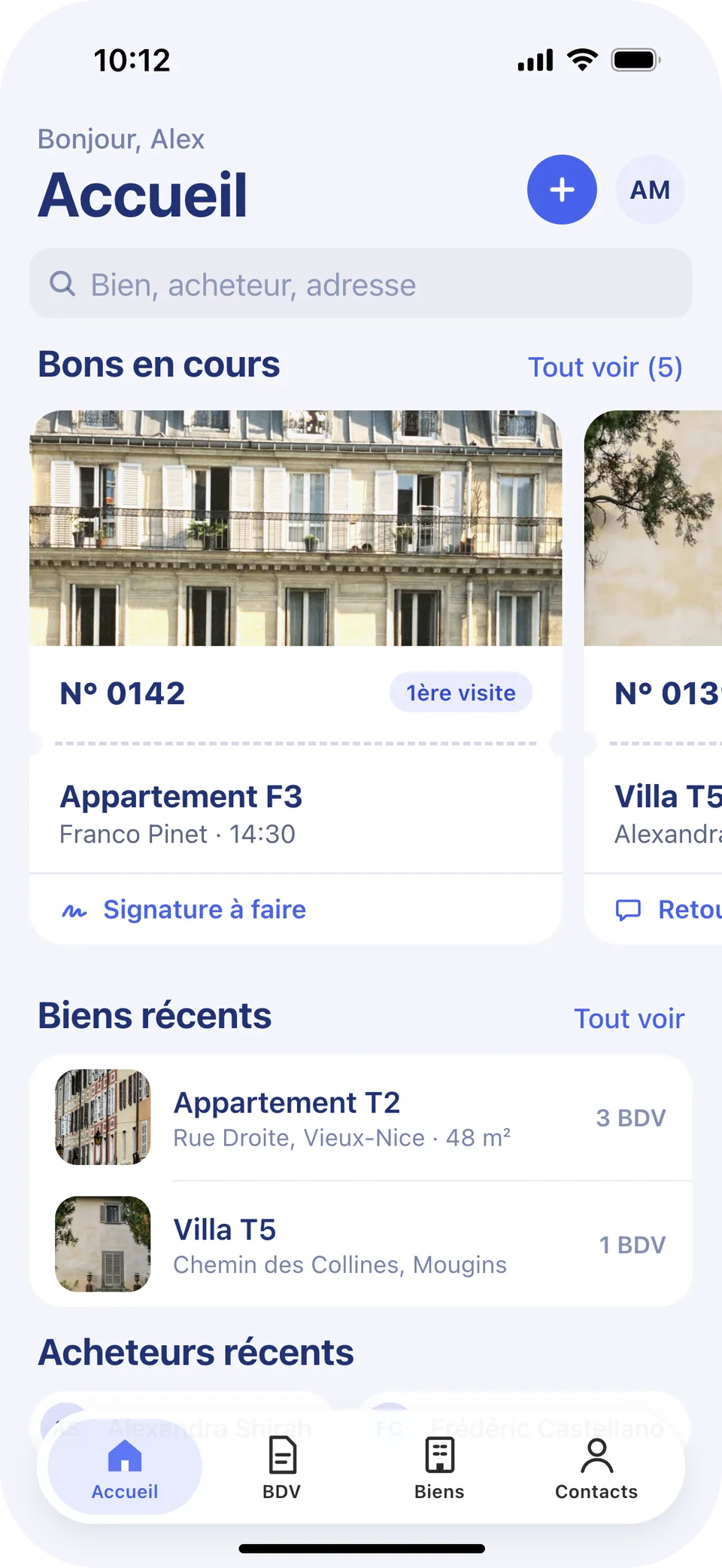
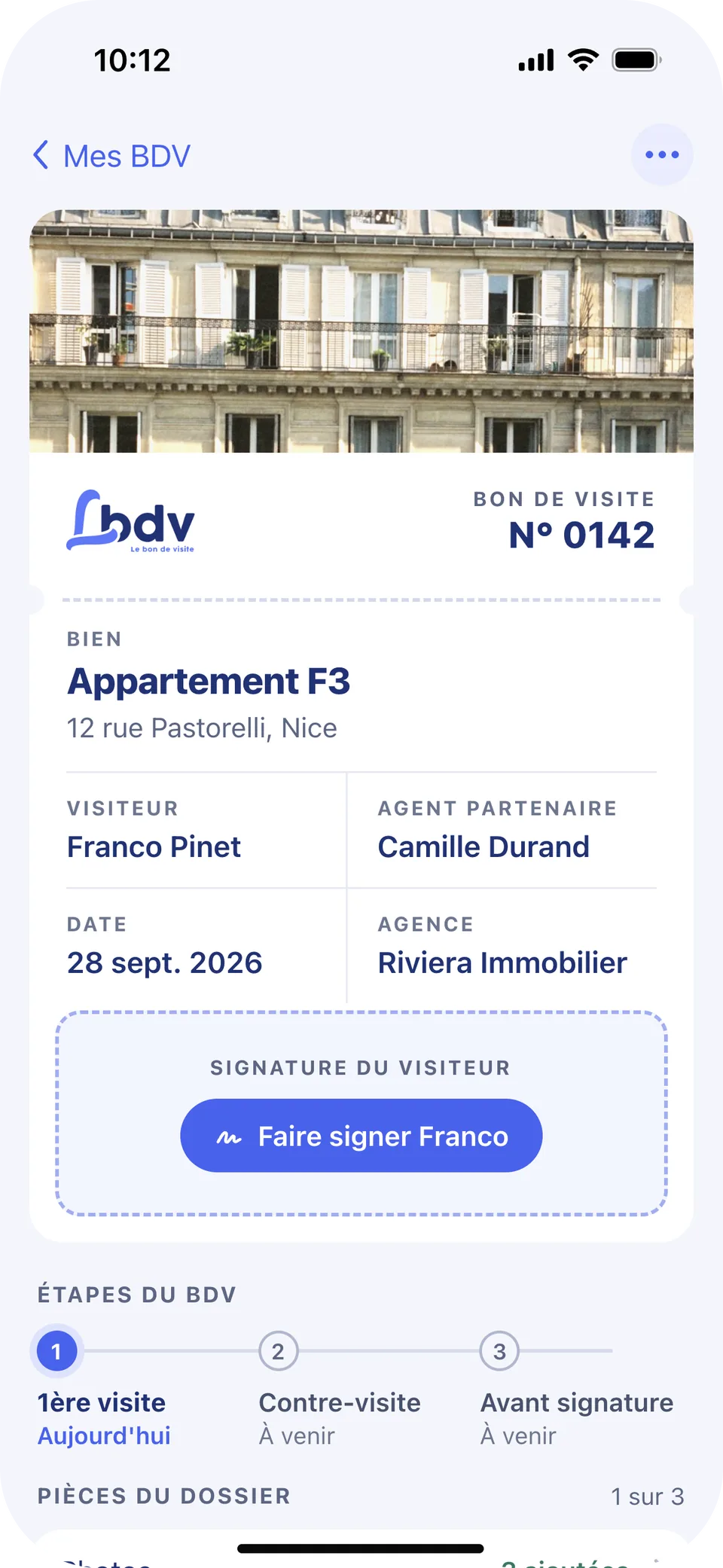
- 1The slip, on every bonA number, the stage and a tear line. It's the same slip the agent sees on the record and hands over for signing.
- 2What's next, on the cardEach bon says its next step, like a signature or the buyer's feedback, so there's no need to open it to know.
- 3New bon and account, top rightThe one primary action and the account sit on the trailing side, and the tab bar floats over the content.
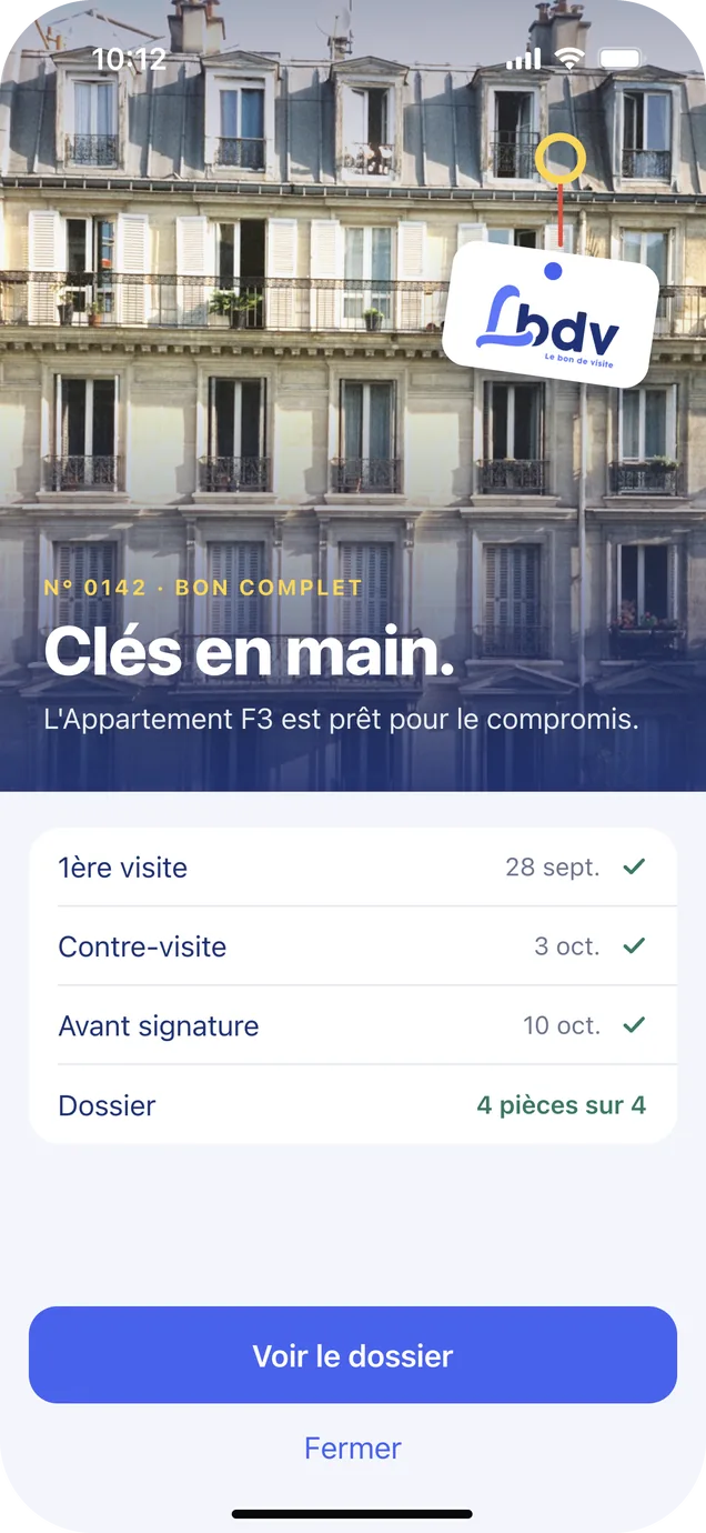
- 4The record is the slipStages follow the visits leading up to the compromis de vente, the preliminary sales agreement: first visit, contre-visite, then before signing. The dossier shows what's collected.
From create to complete
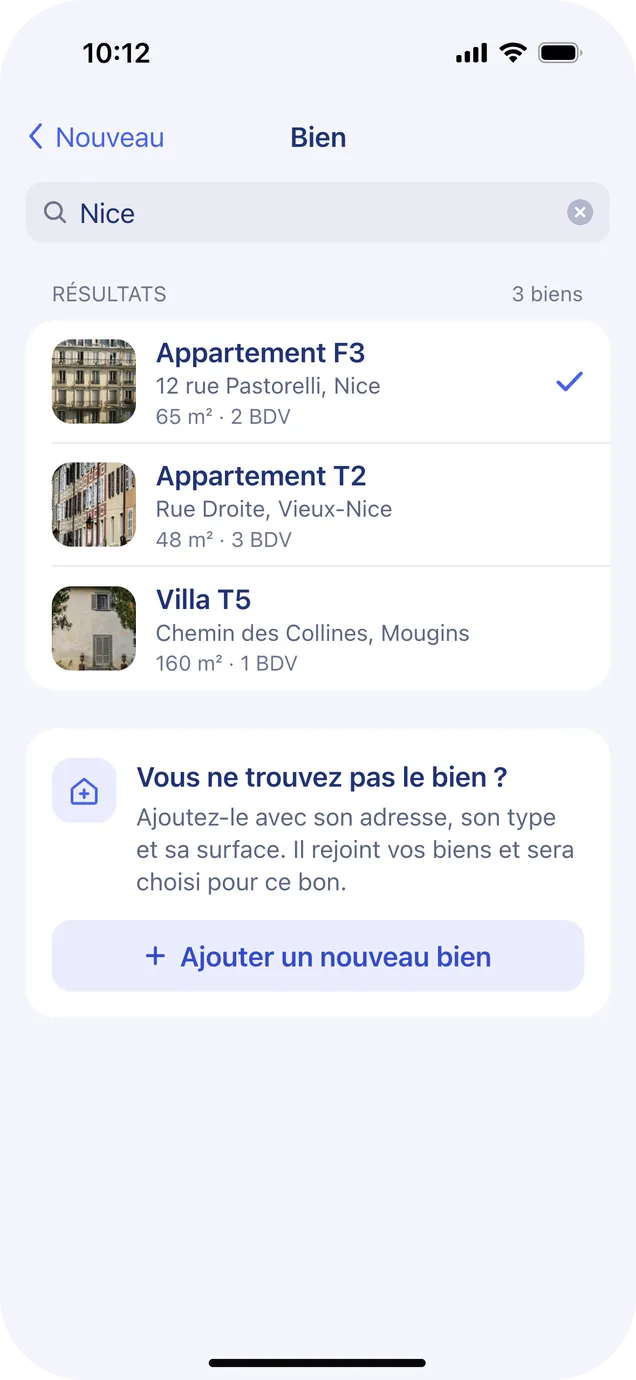
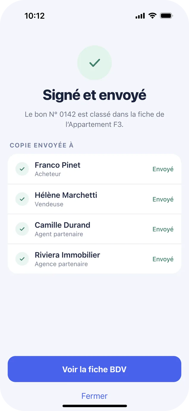
Most of the flow is for the agent, apart from signing: that's the one moment the buyer holds the phone, so that screen is written to them. The brand appears at launch and comes back once the whole bon is complete.
Watch faces: beyond the phone
I also design watch faces as a side project: themed collections including botanicals, dogs, cats and soccer, published on Garmin, Huawei and Google Play.